Where the rail meets the road

In evaluating the current state of the MTA transit system the growing divide between the infrastructural system and the end user interactivity raises serious concern about the efficiency of the functionality of the Subways. (i) station is proposed as an informational interface and economic engine which at the point of confluence seeks to synthesize the system with its users through branding and information transmission.

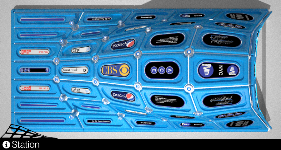
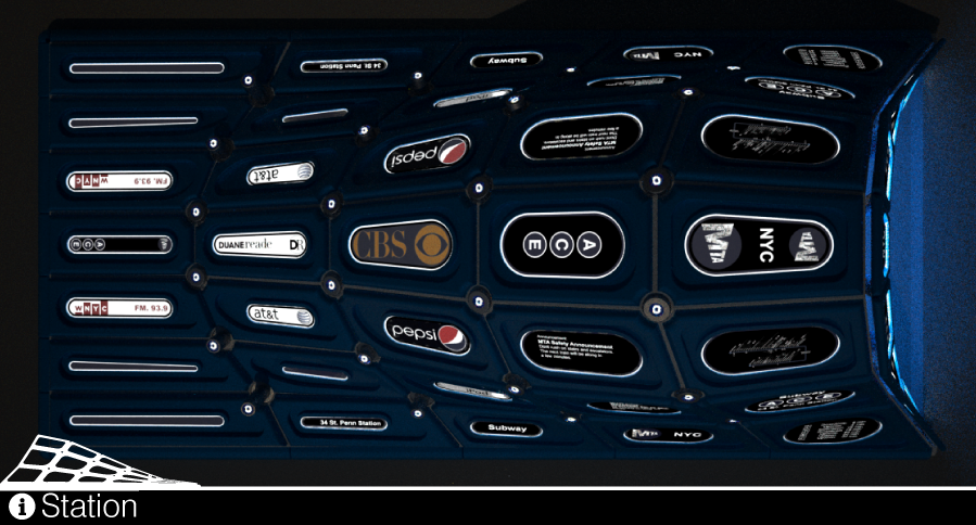
The form derived as a mediation between program, an entrance to a subterranean system, environmental mediator, water/ dispersion and solar alignment of surface and acknowledgment of urban vertical occupation as relating to visual axis. Cladding this form is an information and advertisement LED display system which continually updates the user with current transit system data. This display system is held in a series of colored custom milled aluminum panels whose color reflects the dominant subway line for which the entry serves evoke the iconic form of the subway car window as they transition across the faceted surface. Supporting these panels a structural systems meets at cylindrical nodes, which serve as lighting for the entries interior, crossing aesthetics, structure and function into one architectural moment. The lights, which are easily accessible from the outer surface are capped with brushed aluminum radial caps which contain and high intensity LED icon of the subway line contained within, further developing the branding/ visual accessibility of the system.


